
The funny thing is, they know they have to convince a fair number of gun owners to go along with their schemes, which is why a poster like this is just so damned full of fail:
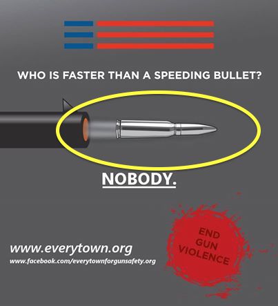
Something must be really wrong with that rifle if it’s shooting out the whole cartridge like that. To enlighten our gun safety experts at Everytown, the bullet is the shiny thing at the end (they also aren’t usually silver, unless you’re hunting werewolves), and that’s the only part that goes down the barrel. I kind of thing if you’re going to lecture fellow Americans about “gun safety,” you ought to at least get the basics correct. And notice that’s a rifle bullet. I thought you guys were giving up on the whole “assault weapons” thing? And outrunning bullets is exactly what these folks expect us to try to do because they are strong believers in a duty to retreat.
UPDATE: Miguel has more background.
Maybe a smoothbore? They argue, after all, that we should be limited to firearms around at the time of the Founding.
Yeah, and then they require all non-shotguns to have rifling.
I think that Remington makes some nickel-plated rifle cartridge cases, with nickel plated projectile for a Safari-grade load. They should probably sue EGS for misuse of their trademarked ammo.
Are you implying that they should know something – anything – about what they want to ban?
That’s RACIST!!!!!!
Or something.
As a graphics-guy I cringe at the cheesy cheapness of their designer’s work, who must be some inexperienced 14-year old kid in the basement doing their stuff. The angled shading on the cartridge makes it look bent. The yellow “emphasis-oval” is off-center and cuts-off the unrealistic front-sight. The long fuzzy red three stripes at the top, next to the blue short stripes signify…what? And the generally muddy color choices inspires a feeling of Meh. Gray is a terrible background color. Overall a “D” for design-layout execution. Bad-bad.
Actually, the yellow oval was added by Sebastian.
But it’s telling that it honsetly looks like a part of the original layout.
Thanks Bitter! I discovered that only after I went to “No Lawyers – Only Guns and Money” and saw the difference. Still, the most *dynamic* bit at the muzzle, meant to imply velocity, is just a fog.
“The angled shading on the cartridge makes it look bent.”
I dunno. If you shot the whole cartridge out of a gun, it probably would bend.
UGGGGHHHHH!!!!!
I knew they were bad, but I thought they were better than that.
Also, that cartridge looks like a 20mm
I was thinking 6.5 Grendel, but with weird crimping around the neck. Ugh. Is it that hard to fire up wikipedia and look up what a cartridge looks like?
I pledge to end gun violence. Any homeless gun, any gun being threatened by gun-destroying bullies, can come live with me instead. Beaten, scratched, allowed to rust and corrode – I pledge to give it a happy home.
The Second Amendment: Because Every Lonely Unloved Gun Needs a Second Chance.
Of course we should do what we can to end “gun violence”. Why, just the other day, I overheard my Glock talking to my Sig Sauer about “taking care of” the cat. I washed both of their mouths out with Hoppe’s No 9. /;-)
Maybe they were thinking some people could outrun a bullet- but a “Two-Stage Rocket Heatseaking Bullet”… Well, nobody is getting passed that.
You would think 50 million in sugar daddy Bloomberg bucks could buy decent graphics, but no, even their artwork is full of lies.