
I just wrote about the trends in my own county’s license to carry a firearm issuance and noted that year-over-year, the numbers were up more than 65%. So you’d think that I’d be cheering this piece at The Reload for covering the statewide numbers and looking at how Philadelphia County was out of whack with the rest.
But I’m not.
Why? Because while I did look at year-over-year data in my post, it was presented with very important contextual information – like the closure of offices, shifting demand, and where we stood compared to 5 years ago which matters for looking at trends. Now that still isn’t the entire picture, but it puts the 65% increase into an important context that takes into account those with expiring licenses from 5 years earlier. (If everyone renewed exactly when they needed to do so, that is responsible for 42% of the issuances in 2020.) And the introduction of an online application may have shifted more early 2021 renewals into 2020 – all data we won’t be able to see in trends until next spring.
Are license issuances up? Without question. The questions are on how much.
And here’s why The Reload’s piece leaving out information about the shifts in demand bothers me. Because how you present data can change the picture of things quite a bit.
Take the graph below. In red, I used Stephen Gutowski’s model of strictly looking at year-over-year data to plot change in demand on my county since 2004. (I have my county’s historical numbers saved for easy calculations, but not the statewide data.) According to his method, our county’s issuance rates have gone on a wild ride of a low of -26.1% decline (2014) to the high of 65.1% growth (2020) with repeated declines in 2019, 2017, 2014, 2010, 2008, and 2004.
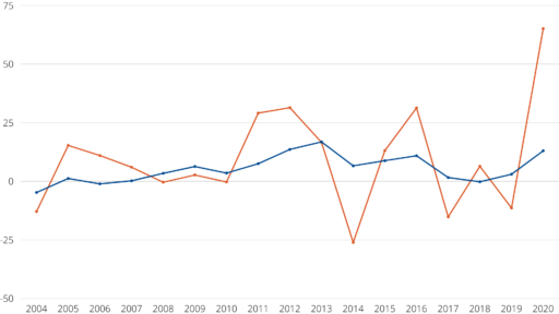
But that steadier blue line? That’s the rate of change on issuances for rolling 5 year periods – the period that licenses are valid in Pennsylvania. That shows a much steadier rate of change from a low of -4.8% (2004) to a high of 16.8% (2013) with small declines only in 2018, 2006, and 2004.
And, if you want raw numbers, here are the rates of currently valid licenses for the same county over the same period (total of previous 5 years of issued licenses). This trend line looks very different than the rates of change in issuance…
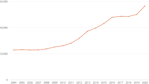
Why does this look so different than even my tamer rolling 5 year numbers above? Because of the way it accounts for surge years. The end of 2012 and 2013 were incredibly high due to the political fallout and threats following Sandy Hook in late 2012, so we saw a license issuance drop in 2014 because all of those new licenses issued 1-2 years prior were still valid. That doesn’t mean that all of those newly licensed people disappeared. They should be part of the numbers through at least 2018 when those 2013 LTCs expired. (We did actually see a very small drop between 2017 and 2018 – not all of those people who got their licenses opted to renew them, clearly.)
So while year-over-year data has a place in analysis of where we stand with the right to bear arms movement and possible sympathetic voters in Pennsylvania, it’s not the whole picture and no one should get too excited by extreme swings up because they are usually followed by slight drops later on.